
Things have changed around here. A number of changes have been made to the site design, some obvious and some less so. Here is a rundown of what has changed, and why.
Grids, grids, grids
The site as it was felt somewhat uneven. It was difficult to say exactly what was wrong, just that it didn’t quite feel ‘correct’ (here is the old design, and the new design ((You might be interested to know that the snazzy zoom effect used for these images is freely available from Cabel Sasser at his blog.))).
To address this imbalance, I have aligned the major layout elements to a 960px-wide grid ((For those who care, it is a ’960 Grid System’ 60px, 12 column grid with 20px gutter. It is available here.)). This has increased the width of both sidebars (post date on the left, search box on the right) as well as the main content div. In addition, these widths are nicely set in a consistent ratio of 2:7:3. This consistency may not be obvious, but in my opinion it helps the page to feel more ordered (here is the new design with grid overlay).
For further reading on grid based web design, this article at Smashing Magazine is a good place to start.
Typography
The main change here has been margins and padding. A few headers and various other block level elements had uneven padding or margins and the overall effect was a slightly disordered look.
I reset all text margins and padding, and then spaced elements as required. I hope that this makes for a more ordered feel to posts.
UPDATE: I have had another crack at this as it still didn’t look correct. Whilst I was at it I also converted font sizes and top/bottom margins from px to ems. This should help the site to scale more easily when users change the default font size.
I have changed the margins of most elements in order to achieve a better flow from one to another, and to help separate discrete bodies of text ((Here is an article from Smashing Magazine and another from 24 Ways which helped)).
Browser Compatibility
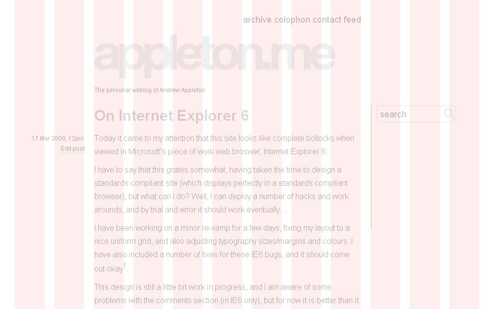
The initial design for this site was tested in Firefox, Chrome, IE7 and Safari (Mac/Windows and iPhone). You may have noticed an IE6 sized gap there, and just recently, so have I. My server stats only show a handful of unique visitors using Internet Explorer 6, but given the sight which would have greeted them, I don’t think I should expect them back in a hurry.
Take another look at that last link. It has the title of the first post kind of overlaid onto the post body. It has the menu bar, header and sidebar way off to the right. If you were to scroll to the comments section, you would find a similar problem. Not ideal.
It turns out that this is the result of a well known bug in IE6. The result is that margins on floated elements are doubled. Since many of my div boxes are floated with margins, they have this problem. This is fixed by a small browser specific CSS file, which is called only if IE6 (or lower) is detected ((This is done using the Internet Explorer specific feature “Conditional Comments”. Read more here.)). This means that the hacks are targeted at IE, and do not affect any of the more compliant browsers.
Colours
I have am a big fan of minimal, large typeface web design and have tried to keep this site true to that. It uses lots of white space, and type large enough that the reader can sit back in their chair. I felt that the clean colours of the site could do with a brighter accent colour than the muted red from before, so here is is! Also, I like green more than red. So there.
Comments
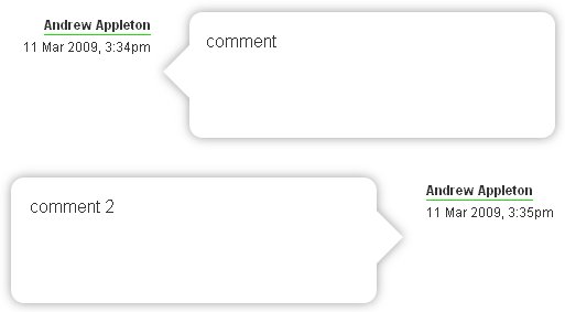
The layout for comments section has been revised.
Each comment is enclosed in a kind of drop shadow speech bubble, and they alternate direction as they move down the page. These speech bubbles are formed from a top, middle and bottom background image, and are able to increase in height to accommodate long comments. This alternate design is loosely inspired by the threaded speech bubbles in iChat and the iPhone SMS application.
And Finally… XHTML 1.0 Strict
The last change of note was a move from XHTML 1.0 Transitional to XHTML 1.0 Strict. This was not really a big ask, as it involved replacing the DOCTYPE declaration and fixing two validation errors.
Being a new site, there is no legacy HTML lying around requiring the use of the Transitional DOCTYPE, so why not!